A beautiful mood board that fails to produce a cohesive collection is not a creative tool; it is a strategic failure.
- The true purpose of a mood board is not to be a collage of inspiration, but a strategic blueprint and a visual contract for your entire team.
- Protecting your brand DNA by filtering out fleeting trends is more profitable than chasing viral moments.
Recommendation: Structure every collection board using the ‘Pyramid Model’ (Hero, Commercial, Core) to ensure you are intentionally balancing artistic vision with commercial reality.
Let’s be clear. You, the aspiring art director, have a folder overflowing with beautiful images. You’ve spent hours on Pinterest, scoured vintage magazines, and captured the perfect, moody sunset. You assemble it all into a stunning mood board, present it with passion, and yet, six months later, the collection that hits the racks is a disjointed mess. The vision is lost. This is a common frustration, born from a fundamental misunderstanding of the tool itself. Most treat the mood board as a sandbox for creativity, a collage of « inspiration. »
This is a mistake. The problem isn’t a lack of creativity; it’s a lack of strategic translation. A professional mood board is not a piece of art. It is a blueprint. It is a visual contract that must be so clear, so intentional, that a designer, a merchandiser, and a photographer can all execute their roles from it without your constant supervision. It is a tool for clarity, not just creativity. Its job is to build a world so cohesive that it can be reverse-engineered into sellable products. This guide is not about finding prettier pictures. It’s about building a system—a visual language—that ensures your vision makes it from the board to the customer, intact.
This article will deconstruct the process of creating a truly effective mood board. We’ll explore why consistency is your most valuable asset, how to define roles for seamless collaboration, and how to use your board as a shield against diluting trends. We will then dive into the practicalities of execution, from directing a photoshoot to balancing heritage with innovation, culminating in a powerful framework to ensure your collection is both artistically resonant and commercially successful.
Contents: The Art Director’s Blueprint for a Cohesive Collection
- Why Consistency Beats Creativity When Building Brand Recognition?
- Art Director vs Fashion Designer: Who Decides What?
- The Risk of Losing Your Brand DNA When Chasing Viral Trends
- When to Pivot Your Aesthetic: 3 Signs Your Brand Look Is Stale?
- How to Direct a Photoshoot to Get the Campaign Images You Need?
- How to Balance Archive References with Modern Innovation?
- Why Hand-Drawn Illustration Is Making a Comeback in Digital Campaigns?
- How to Plan a Fashion Collection That Balances Art and Commerce?
Why Consistency Beats Creativity When Building Brand Recognition?
In the world of fashion, the siren call of novelty is constant. New trends, new colors, new « aesthetics » emerge daily. It is tempting to believe that relentless creativity is the path to success. This is a fallacy. For a brand, the most powerful commercial force is not unbridled creativity, but unwavering consistency. When your visual language is consistent, you build recognition, trust, and, ultimately, loyalty. In fact, research from brand identity specialists shows that brand consistency can lead to a 33% revenue increase.
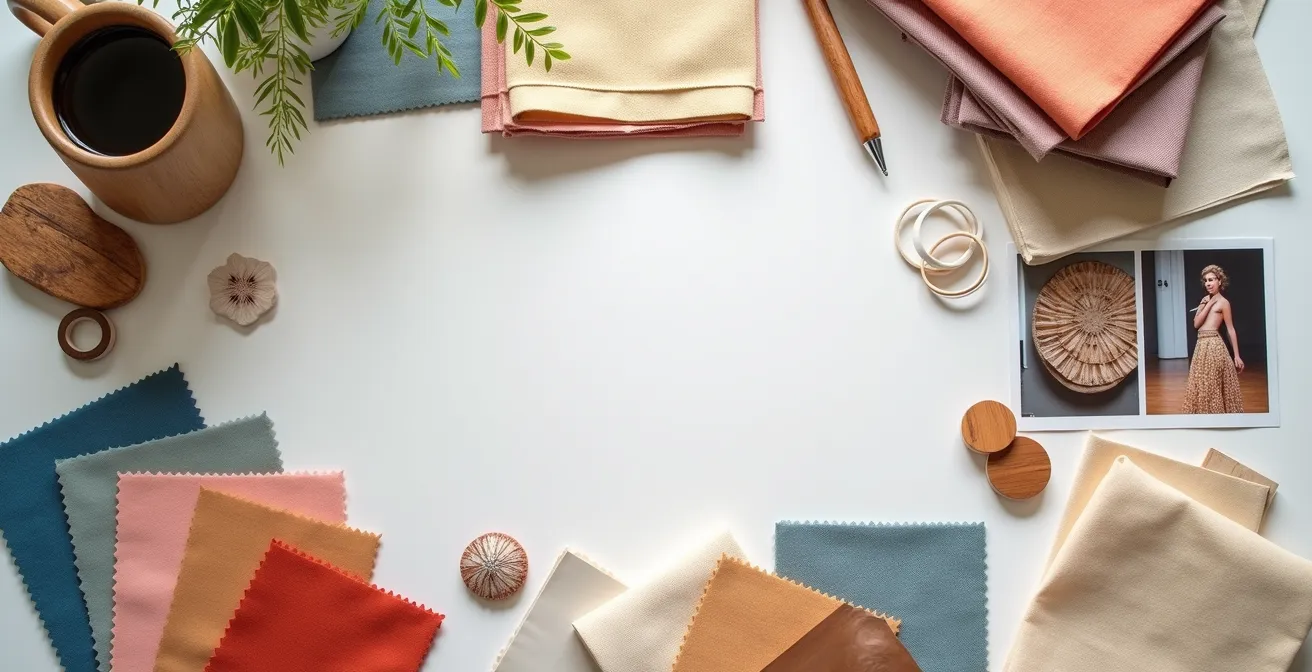
The mood board is your primary tool for enforcing this consistency. It is where you codify your brand’s core identity long before a single garment is sketched. This « Core Identity Board » isn’t about a single season; it’s the foundational document. It must define the non-negotiables:
- Your Color Palette: Not just this season’s trendy hues, but the core colors that will appear in every collection, ensuring a consistent thread.
- Your Texture Samples: The tactile identity of your brand, defined by specific fabric swatches and material references that feel like « you. »
- Your Pattern Library: A documented set of signature prints or graphic motifs that are uniquely yours.
Consider the mood board created for Coca-Cola’s No Sugar campaign. It didn’t just show people drinking soda; it showcased a specific « coolness » and attitude. It positioned the taste as aspirational, a feeling beyond flavor. This is the work of a strategic board: it translates abstract values into a concrete visual world that guides every subsequent creative decision, ensuring the final product—be it a can or a campaign—feels undeniably like the brand.
Art Director vs Fashion Designer: Who Decides What?
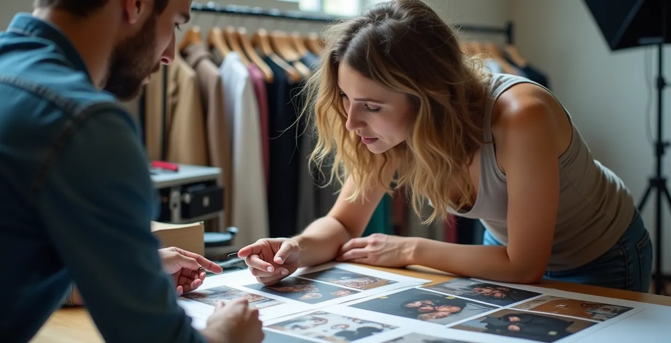
A mood board that lives only in the Art Director’s head is useless. Its purpose is to facilitate collaboration and eliminate ambiguity across teams. One of the biggest points of failure in translating vision to product is a lack of clearly defined roles, especially between the Art Director and the Fashion Designer. Who owns the big-picture vision? Who is responsible for the technical execution of a garment? Without clarity, you get conflict, compromises, and a diluted final collection.
The mood board serves as the shared « map » for this collaboration, but the responsibilities for each part of the journey must be explicit. A RACI (Responsible, Accountable, Consulted, Informed) chart is not just corporate jargon; it’s an essential tool for a high-functioning creative team. It delineates who does what, preventing territorial disputes and ensuring a smooth workflow from concept to commerce. When it comes to mood board development and execution, clarity is non-negotiable.
The following breakdown clarifies how these key roles typically interact. The Art Director is accountable for the overall brand vision, while the Fashion Designer is responsible for translating that vision into tangible garments, with crucial input from merchandising on commercial viability.
| Task | Art Director | Fashion Designer | Merchandiser |
|---|---|---|---|
| Brand Vision | Accountable | Consulted | Informed |
| Seasonal Concept | Responsible | Responsible | Consulted |
| Garment Execution | Consulted | Responsible | Informed |
| Price Point Feasibility | Informed | Consulted | Responsible |
By defining these roles, the mood board transforms from a potential source of conflict into a true visual contract. Everyone understands their contribution and how it connects to the larger vision, ensuring the artistic concept is always grounded in the practical realities of design and sales, a principle established in a clear project workflow.
The Risk of Losing Your Brand DNA When Chasing Viral Trends
In the digital age, trends move at the speed of a TikTok video. What’s viral today is forgotten tomorrow. For a brand, the temptation to jump on every « core » aesthetic or micro-trend is immense, promising a quick hit of relevance. However, this is a dangerous game. Chasing viral trends without a filter is the fastest way to dilute your brand DNA and alienate the audience you’ve worked so hard to build. Your brand becomes a cheap imitation of others, losing its unique voice and value proposition.
Your mood board must function not as a funnel to pour every trend into, but as a filter. Its primary role here is defensive: to protect your brand’s core identity. The most powerful exercise an Art Director can lead is not the creation of a mood board, but the creation of an *anti-trend* board. This is a visual document of all the current trends that, while popular, fundamentally contradict your brand’s values, aesthetic, or mission. It becomes a powerful reference tool for the entire team, a constant reminder of what *not* to do. It forces a critical conversation: « Is this popular because it’s good, or is it just popular? And more importantly, is it *us*? »
Creating this filter strengthens your brand’s integrity and forces a higher level of creativity, pushing your team to innovate within your own established world rather than borrowing from others.
Action Plan: The Anti-Trend Board Creation Process
- Identify & Collect: Actively research and gather images of the most pervasive viral trends currently dominating your market segment.
- Curate the Contradiction: Create a dedicated visual board featuring only the trends that conflict with your core brand values (e.g., if your brand is about timeless minimalism, collect images of maximalist, Y2K-inspired fashion).
- Articulate the ‘Why’: For each trend on the board, write a concise statement explaining exactly why it does not align with your brand’s DNA, mission, or target audience.
- Establish as a Filter: Use this ‘anti-trend board’ as a mandatory checkpoint when evaluating any new design ideas, color palettes, or campaign concepts to ensure they remain true to the brand.
- Review and Update: Revisit and update this board quarterly to reflect the changing trend landscape and maintain its relevance as a strategic filtering tool.
When to Pivot Your Aesthetic: 3 Signs Your Brand Look Is Stale?
While consistency is paramount, it is not synonymous with stagnation. The strongest brands evolve. The key is to pivot intentionally, not reactively. A brand’s aesthetic can become stale, losing its connection with an evolving customer base or a changing cultural landscape. Recognizing the signs of fatigue is a critical skill for an Art Director. But how do you know when it’s time to refresh your visual language versus staying the course?
The creation of mood boards involves a recognizable process coupled with creativity… offering the creator opportunities for deep levels of engagement to take place in order to develop creative and innovative design solutions.
– Tracy Cassidy, Fashion Practice Journal – Manchester Metropolitan University
The pivot should be born from this « deep level of engagement, » not from panic. There are three key indicators that a strategic pivot might be necessary:
- Diminishing Engagement from Your Core Audience: If your most loyal customers are no longer excited by your campaigns or products, it’s a major red flag. This isn’t about chasing new customers, but about potentially losing your base.
- Your Competitors Have Co-opted Your Look: When your unique aesthetic becomes the category standard, it loses its power to differentiate. If emerging brands look just like you, it’s time to find the next evolution of your own identity.
- Your Visuals No Longer Reflect Your Product Innovation: If your products have evolved—incorporating new technologies, materials, or ethical standards—but your campaigns still look the same as they did five years ago, there’s a disconnect. Your aesthetic must support and communicate your brand’s progress.
When these signs appear, trend forecasters and design directors use mood boards to set the tone for the upcoming seasons. These boards are not a radical break from the past but an evolution. They collect and communicate the new direction internally, guiding creative decisions across collections and marketing to ensure the pivot is cohesive and strategic, not chaotic.
How to Direct a Photoshoot to Get the Campaign Images You Need?
The photoshoot is the final exam for your mood board. It’s the moment where the abstract vision is translated into the concrete, high-stakes assets that will represent your brand for an entire season. A weak or ambiguous mood board leads to a chaotic shoot, wasted resources, and generic images. A strong, strategic board, however, becomes the director’s most powerful tool on set, ensuring every shot serves the overall narrative.
The board’s role here is not just « mood. » It must be a precise, technical brief. It should be deconstructed into role-specific views that leave no room for misinterpretation. The photographer, stylist, and makeup artist should not have to guess your intention. You must provide them with a clear, visual roadmap derived directly from the master mood board. This level of preparation is the difference between hoping for a good shot and directing your team to create the exact image you need.
Your pre-production package must include these non-negotiable elements:
- Photographer’s View: A dedicated section of the board focusing purely on lighting, composition, and camera angles. Include technical references, from stark, high-contrast lighting to soft, natural window light.
- Stylist’s View: A detailed breakdown of specific looks, layering techniques, and accessory placement. Go beyond the whole outfit and show close-ups of a specific cuff roll or collar pop that defines the attitude.
- MUA’s View: Visuals highlighting desired skin texture (dewy vs. matte), makeup details (a sharp eyeliner vs. a smudged lip), and hair styling.
- Shot List Integration: Explicitly state which board element corresponds to which shot type. Connect your hero images to styled hero shots, your texture swatches to detailed captures, and your product-in-use concepts to e-commerce shots on a white background.
By breaking down the master vision into these granular, actionable instructions, you empower your team to execute with precision and creativity within the strategic framework you’ve built.
How to Balance Archive References with Modern Innovation?
A brand without a history is a brand without a soul. Your archives—even if they are just from a few seasons ago—are a rich source of brand DNA. However, relying too heavily on the past can lead to work that feels dated or repetitive. The challenge for any creative lead is to mine the archive for inspiration without becoming a prisoner to it. This delicate balance between heritage and innovation is forged on the mood board.
The process isn’t about simply placing a vintage photo next to a modern one. It’s about a « deconstructed archive » technique. You must dissect the historical references to understand their core components—a unique silhouette, a forgotten color combination, a particular tailoring technique. Then, you can use the mood board to explore how to reinterpret these elements in a contemporary context. The board becomes a space for dialogue between the past and the future.
For this process to be truly innovative, it must be structured. The goal is to create a visual conversation where archive and modern elements are juxtaposed to spark new ideas. This prevents you from creating literal reproductions and instead pushes you toward genuine evolution.
| Archive Element | Modern Interpretation | Application on Mood Board |
|---|---|---|
| Historical Silhouette | Contemporary Materials | Place side by side for contrast |
| Vintage Color Palette | Digital Color Enhancement | Create gradient transitions |
| Classic Pattern | Scaled/Remixed Version | Overlay or juxtapose |
| Traditional Technique | Tech-Enhanced Process | Document both methods visually |
This systematic approach, as detailed in guides for creating compelling fashion moodboards, ensures that your brand’s heritage is a springboard for innovation, not an anchor. You honor the past by reinventing it, not repeating it.
Why Hand-Drawn Illustration Is Making a Comeback in Digital Campaigns?
In a world saturated with slick, digitally rendered perfection and AI-generated imagery, there is a growing hunger for the human touch. This is why hand-drawn illustration and physical, tactile mood boards are making a powerful comeback, not as a nostalgic throwback, but as a strategic tool. The « flaws »—the imperfect lines of a sketch, the texture of a real fabric swatch—communicate authenticity and craft in a way that a pixel-perfect image cannot. This return to the physical is a direct response to digital fatigue.
The creative process itself is different. Working with physical materials—cutting, pasting, drawing—engages the brain in a more holistic way. In fact, studies on mood board creation methods show that 87% of designers report enhanced creativity when working with physical versus purely digital tools. This tactile process slows down thinking, encouraging more deliberate choices and often leading to more unique and personal outcomes. The hand-drawn element is not just a style; it’s evidence of a human-led creative process.
When you integrate these elements into your final digital campaigns, they act as a signifier of quality and originality. To do this effectively, your initial mood board should be a physical artifact. It is a collection of tangible objects, not just JPEGs. This board should include:
- Printed inspiration images with varied textures and finishes.
- Physical color and fabric swatches that show true color and drape.
- Original sketches and drawings that capture the energy and movement of a design.
- 3D objects and embellishments like buttons, zippers, or beads that add a layer of reality.
This physical board becomes the « master, » which can then be photographed and integrated into digital presentations. The presence of these hand-made elements tells a story of craftsmanship before a single word is read.
Key Takeaways
- The Blueprint, Not the Collage: Your mood board’s primary function is to be a strategic, actionable plan for your entire team, not a scrapbook of pretty images.
- Consistency Is Commercial Strength: Protecting your brand’s core visual identity from fleeting trends is more profitable and builds more long-term value than chasing viral moments.
- The Pyramid of Balance: Structure your collection planning around the 20/50/30 model (Hero/Commercial/Core) to intentionally balance artistic vision with the necessity of commerce.
How to Plan a Fashion Collection That Balances Art and Commerce?
We arrive at the ultimate mandate for any Art Director or creative lead: bridging the gap between pure artistic expression and commercial necessity. A collection that is all art may win awards but bankrupt the company. A collection that is all commerce is soulless and will eventually be out-competed on price. The solution lies in planning this balance intentionally, and the tool for this is a structured « Pyramid Mood Board. »
This is not a single board, but a board that is consciously divided into three strategic tiers. This structure forces you to allocate visual real estate—and therefore, collection budget and focus—in a way that serves both the brand’s image and its bottom line. It’s the final, most crucial step in turning a mood board from a collection of ideas into a true business plan. The purpose of this board is to serve as a constant reference point, ensuring consistency in color, typography, and imagery across all branding efforts.
The Pyramid Mood Board is structured as follows:
- Top – The 20% « Hero » or « Press » Pieces: This is the pinnacle of your vision. These are the highly creative, statement-making pieces that will be used in editorials and worn by influencers. They embody the purest form of your seasonal concept, even if they aren’t big sellers. They are for marketing and brand building.
- Middle – The 50% « Core Commercial » Product: This is the heart of your business. This section of the board is dedicated to translating the « hero » vision into more accessible, sellable items. It takes the key colors, silhouettes, and details from the top tier and reworks them for your main customer base.
- Base – The 30% « Carryover » or « Basics »: This tier is about profitability and customer loyalty. It features your brand’s essential, never-out-of-stock items, updated with new colors or materials from the seasonal mood board. This ensures even your basics feel fresh and connected to the main collection.
By using this pyramid structure, you are not leaving the art/commerce balance to chance. You are designing it. You are creating a collection that is both inspiring and intelligent, artistic and profitable. This is the final translation of vision into a viable product.
Your next collection’s success is not a matter of chance; it’s a matter of design. Start building your blueprint, not just your board, and ensure every creative decision is a strategic one.