A store layout isn’t about aesthetics; it’s a psychological script that directs customer behavior to maximize profit.
- Effective layouts reduce cognitive friction, making it easier for customers to decide and buy.
- Every design choice, from product placement to aisle width, must be tied to a specific KPI like Units Per Transaction (UPT) or Average Transaction Value (ATV).
Recommendation: Stop thinking like a decorator and start thinking like a behavioral architect. Analyze customer flow and sales data to design a space that actively guides shoppers toward a purchase.
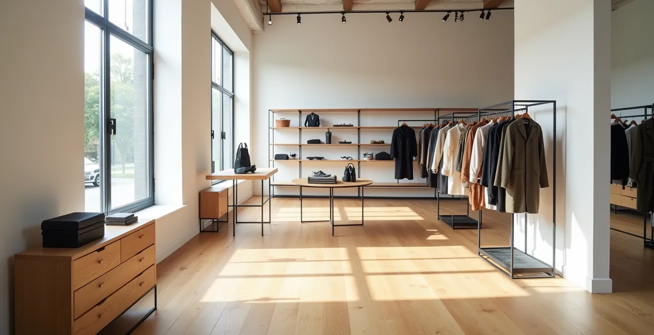
For most store managers and visual merchandisers, designing a retail layout is an exercise in aesthetics and logistics. The goal is often to make the store look appealing and fit as much product as possible onto the floor. Common advice revolves around keeping things clean, ensuring good lighting, and placing popular items where they can be seen. While these are not wrong, they treat the symptom, not the cause of low conversion. They operate on the surface, ignoring the powerful, often subconscious, forces that truly drive a customer’s decision to buy.
The fundamental mistake is viewing your store as a static container for goods. But what if the layout itself is not a container, but an active selling tool? What if every fixture, pathway, and product grouping could be part of a carefully constructed psychological script? This is the core of behavioral architecture. It reframes layout design from a question of ‘Where does this fit?’ to ‘What behavior do I want to trigger here?’. By understanding the cognitive biases and sensory triggers that influence purchasing, you can move beyond generic best practices and start engineering a space that systematically boosts key performance indicators.
This article will guide you through the principles of designing a KPI-driven store layout. We will deconstruct the psychology of placement, explore strategies to prevent decision fatigue, and connect every tactic back to measurable financial outcomes. You will learn to see your floor plan not as a map, but as a machine for conversion.
To help you navigate these powerful concepts, this guide is structured to build your expertise from foundational principles to advanced strategies. Here is a look at the key areas we will cover, each designed to equip you with actionable, profit-focused insights.
Summary: The Psychology of Store Layout That Converts
- Why Eye-Level Placement Can Double Product Sales?
- The Risk of « Analysis Paralysis » caused by Cluttered Displays
- How to Use Cross-Merchandising to Bundle Products Effectively?
- When to Rotate Stock to Keep the Store Looking Fresh?
- Visual Merchandising for Web vs Store: What Changes?
- Why Physical Retail Is Not Dead: The Role of Experiential Shopping?
- UPT vs ATV: Which KPI Should You Focus on to Hit Target?
- How to Motivate Sales Associates to Hit KPIs Without Stress?
Why Eye-Level Placement Can Double Product Sales?
The old retail adage « eye level is buy level » is more than just a catchy phrase; it’s a principle rooted in fundamental human psychology. Our brains are wired to prioritize information that is easiest to process. Products placed directly in a shopper’s line of sight require the least physical and cognitive effort to notice and consider. Anything placed too high or too low forces a conscious, effortful action—looking up or bending down—which introduces a small but significant barrier to the purchase. In a competitive retail environment, this subtle friction is often enough to make a customer move on. In fact, items at eye-level are 82% more likely to be picked up and bought simply due to their effortless visibility.
However, the concept of « eye level » is more nuanced than a simple measurement. It’s a « golden zone » that varies slightly by demographic and even by shelf. True behavioral architecture requires a deeper analysis. The goal is not just to place high-margin products at a generic eye level, but to identify the single most profitable position on the shelf. This level of precision transforms a basic guideline into a powerful profit lever.
Case Study: The Precision of Shelf Four
A UK coffee manufacturer used data science to analyze shelf performance. While shelves three, four, and five were all considered « eye level, » the analysis revealed a critical difference. Shelf four showed a 23 per cent greater potential to increase sales compared to the shelves immediately above or below it. Conversely, products consistently placed on shelf two, just below the prime zone, experienced a 25 per cent drop in sales. By identifying and leveraging the single most effective shelf, the client achieved a significantly higher ROI on their retail space.
This demonstrates that while the general principle is sound, maximum profitability lies in micro-optimization. It’s the difference between knowing the rule and mastering its application. Testing and measuring the performance of specific shelf heights for your key products is essential to unlocking their full sales potential.
The Risk of « Analysis Paralysis » caused by Cluttered Displays
In the quest to maximize sales per square foot, a common temptation is to maximize the amount of merchandise on display. The logic seems simple: more products mean more choices, which should lead to more sales. However, this approach often backfires, triggering a psychological phenomenon known as analysis paralysis or cognitive friction. When a customer is presented with too many options without a clear hierarchy or guidance, the brain becomes overwhelmed. The mental effort required to compare, evaluate, and choose becomes so high that the easiest decision is to make no decision at all.
A cluttered display doesn’t just look messy; it creates a stressful and confusing shopping experience. It lowers the perceived value of the merchandise—even premium products can look cheap when crammed together. The solution is not emptiness, but intentional curation. Strategic visual merchandising uses principles of simplification and focus to guide the customer’s eye, reduce cognitive load, and make the path to purchase feel effortless and intuitive. This is achieved through deliberate use of grouping, highlighting, and negative space.
This paragraph introduces the concept of using negative space to enhance perceived value. The illustration below provides a clear example of this principle in action, showing how less can truly be more.

As you can see, the space around the products is as important as the products themselves. This « visual breathing room » signals quality, focuses attention, and creates a serene, premium atmosphere. Instead of overwhelming the shopper, it invites them to consider each item carefully. To implement this, consider these techniques:
- Apply the ‘Rule of Three’: Grouping products in odd numbers, particularly threes, is visually appealing and provides choice without being overwhelming.
- Create Visual Negative Space: Especially for high-end retailers, displaying fewer items with more space between them can dramatically increase perceived value and desirability.
- Use ‘Speed Bumps’ Strategically: A small sign or « shelf talker » that juts out from a shelf can break up a long, monotonous aisle. It forces a pause, drawing attention to a specific item and encouraging browsing of the entire section.
- Implement a Hero-Helper-Hype Framework: Structure key displays around a central « hero » product, supported by a « helper » accessory and a « hype » or trendy item. This creates a story and a clear point of focus.
How to Use Cross-Merchandising to Bundle Products Effectively?
Effective store layout is not just about placing individual products; it’s about creating relationships between them. Cross-merchandising is the art and science of displaying complementary items from different categories together to inspire additional purchases. It’s a powerful tool for increasing Units Per Transaction (UPT) by shifting the customer’s mindset from « I need to buy X » to « I could create Y. » When done correctly, this strategy can lead to a significant uplift in sales, with some studies showing a 30% increase in sales when complementary products are strategically positioned.
The success of cross-merchandising hinges on understanding the customer’s underlying needs and aspirations. It’s not about randomly placing items next to each other; it’s about telling a coherent story or solving a complete problem. For example, placing pasta, sauce, and parmesan cheese together is a classic solution-based bundle. But a more sophisticated approach might bundle a dress, a handbag, and a specific shade of lipstick for a « date night » look, appealing to an aspirational goal rather than a simple need. This form of behavioral architecture guides the customer’s imagination and makes the add-on purchase feel like a natural, necessary part of their primary purchase.
To implement this effectively, it’s crucial to understand the different psychological drivers behind various bundling strategies. The following table breaks down four key approaches to cross-merchandising, providing a framework for your own in-store execution.
| Bundle Type | Customer Psychology | Product Examples | Placement Strategy |
|---|---|---|---|
| Solution-Based | Problem-solving focus | Morning routine kit, travel essentials | Near checkout, endcaps |
| Aspirational | Lifestyle enhancement | Spa night bundle, date night collection | Themed displays, power walls |
| Bridge Products | Category exploration | Neutral basics between sections | Transition zones between departments |
| Unexpected Adjacency | Surprise discovery | Candles in handbag section | Premium placement areas |
By using this framework, you can move beyond obvious pairings and create truly insightful and inspiring product stories. The goal is to make the bundled purchase feel less like an upsell and more like a curated discovery, transforming the shopping trip into a more engaging and valuable experience for the customer.
When to Rotate Stock to Keep the Store Looking Fresh?
A static store is a dead store. Even the most perfectly designed layout will lose its effectiveness over time as regular customers become familiar with it, developing « store blindness » where they no longer notice displays they see every visit. Keeping the store looking fresh and new is critical for maintaining customer engagement and encouraging discovery. Rotation is not just about bringing in new inventory; it’s about changing the visual and psychological script of the shopping experience. This novelty recaptures attention, slows down the customer journey, and creates new opportunities for impulse buys.
The financial impact of freshness is tangible. Research indicates that shoppers spend 14% more time in shops with displays that change seasonally. This increased dwell time directly correlates with higher conversion rates, as customers have more opportunities to interact with products. The key is to establish a rhythm of rotation that balances predictability with surprise. Customers should feel a sense of discovery on each visit, wondering « what’s new today? » This transforms a routine shopping trip into an exciting treasure hunt, a powerful driver for repeat visits.
However, « rotate frequently » is not an actionable strategy. A KPI-driven approach requires a more structured framework based on data, not just dates on a calendar. Instead of arbitrary resets, rotation should be triggered by specific metrics that indicate customer engagement is waning. This data-driven approach ensures that your efforts are focused where they will have the most impact on the bottom line.
Your Action Plan: The Data-Driven Rotation Audit
- Map Saturation Points: Use foot traffic data or simple observation to identify the predictable paths customers take. When over 80% of shoppers follow the exact same loop, it’s time to create a new « speed bump » or reroute traffic by moving a key display.
- Implement Micro-Rotations: Identify your top 3 « power displays » (like endcaps or entrance tables). Commit to changing the product story or theme on at least one of them weekly. This creates constant, low-effort freshness.
- Review Quarterly Macro-Resets: Analyze sales data by zone. Are there « cold spots » where sales are consistently low? Schedule a quarterly floor plan review to address these zones, considering a layout shift (e.g., from grid to herringbone in one area) to reinvigorate traffic.
- Track Loyalty Plateaus: Monitor your repeat customer data. When the purchase frequency or average spend of your most loyal segment begins to flatten, it’s a strong signal that they are no longer being inspired. Trigger a significant visual refresh to re-engage them.
- A/B Test Display Placements: Treat your floor like a website. Move a key product from an endcap to a power wall for two weeks. Measure the sales lift or drop. Use this data to make permanent, evidence-based placement decisions.
By shifting from a calendar-based to a data-triggered rotation schedule, you ensure your visual merchandising efforts are always working to solve a problem and drive a specific, measurable outcome.
Visual Merchandising for Web vs Store: What Changes?
For years, ecommerce and physical retail were treated as separate channels with distinct merchandising rules. Online, it was about algorithms, filters, and high-quality JPEGs. In-store, it was about fixtures, lighting, and physical product. Today, that line has irrevocably blurred. The modern customer journey is « phygital »—a seamless blend of digital and physical interactions. This shift fundamentally changes the role of the physical store and, consequently, how it must be merchandised. The store is no longer just a point of sale; it’s a media channel, a fulfillment hub, and an experiential playground.
This new reality demands that visual merchandising in-store incorporates digital elements and accommodates new fulfillment models. Your layout must now consider things like a dedicated, well-branded area for Buy Online, Pick-up In-Store (BOPIS) orders, or clear signage and QR codes that link physical products to online reviews, tutorials, or extended range options. The physical space becomes a tangible interface for the brand’s entire ecosystem.
Modern stores are becoming more than a point of sale, too. Today’s retailers need to consider store layouts that incorporate alternative distribution models like local delivery, curbside pickup, and buy online pick-up in-store (BOPIS).
– Tango Analytics, 6 Effective Store Layout Examples
This integration of digital touchpoints within the physical layout transforms the shopping experience. It allows the store to offer the best of both worlds: the tactile, sensory engagement of physical retail combined with the infinite information and convenience of digital.

The key difference is a shift in objective. Online visual merchandising is often optimized for a direct, linear path to purchase. In-store phygital merchandising is optimized for engagement, content creation, and brand immersion. The store layout must now feature « Instagrammable » moments, interactive displays that educate, and seamless transitions between the physical product in a customer’s hand and the digital information on their phone.
Why Physical Retail Is Not Dead: The Role of Experiential Shopping?
In an age where anything can be bought with a single click, the enduring power of physical retail lies in its one true competitive advantage: experience. A brick-and-mortar store can engage all five senses in a way that a website never can. The scent of leather in a high-end boutique, the feel of a fabric, the curated playlist that sets a mood—these are powerful drivers of brand loyalty and purchasing decisions. The transactional advantage may have shifted online, but the experiential advantage remains firmly in the physical realm. Consumers aren’t just looking for products; they’re looking for feelings, and research shows that 79% of consumers agree shopping should be multisensory.
A successful modern store layout is therefore a piece of sensory scaffolding. It’s an environment designed not just for shopping, but for dwelling. The goal is to create a space so compelling that customers want to spend time there, regardless of their initial purchase intent. This is where elements beyond the visual come into play. The strategic use of scent, sound, and touch can have a profound and measurable impact on customer behavior, transforming passive browsers into active buyers.
The evidence for this is compelling. For instance, studies show that almost two-thirds of shoppers say a store’s scent has a direct influence on their decision of where to shop. Furthermore, 54% admit that a pleasant scent makes them inclined to spend more money. Sound is equally influential. Research has demonstrated that slow-tempo, low-volume music encourages shoppers to slow their pace, linger longer, and, as a result, discover and purchase more. These are not aesthetic flourishes; they are calculated psychological tools designed to create an optimal state for purchasing.
A truly experiential store layout thinks beyond fixtures and floor plans. It is a choreographed sensory journey. It considers the texture of the flooring, the temperature of the lighting, and the subtle aroma that greets a customer at the door. By orchestrating these elements, retailers can create a powerful emotional connection with their customers, building brand affinity that transcends price and convenience.
UPT vs ATV: Which KPI Should You Focus on to Hit Target?
A beautiful store that doesn’t drive sales is a gallery, not a retail business. To be a true behavioral architect, every layout decision must be tied to a specific, measurable Key Performance Indicator (KPI). The two most fundamental retail metrics are Units Per Transaction (UPT) and Average Transaction Value (ATV). While often used interchangeably, they represent different customer behaviors and require distinct layout strategies. Your choice of which KPI to prioritize will fundamentally shape your store’s design.
UPT (Units Per Transaction) measures the average number of items a customer purchases. A layout optimized for UPT is a masterclass in add-on selling and impulse buys. Its focus is on product adjacency and creating compelling, easy-to-grab bundles. Think of the small, tempting items at the cash wrap or the strategic placement of accessories near the fitting rooms. The psychological goal is to make adding one more item to the basket feel effortless and logical.
ATV (Average Transaction Value), on the other hand, measures the average amount of money a customer spends. A layout optimized for ATV is focused on trading up. It uses premium positioning, such as eye-level shelves and power walls, to highlight higher-margin products. It employs « good-better-best » displays to psychologically anchor the customer’s perception of value and encourage them to choose the more expensive option. Here, the goal is not to sell *more*, but to sell *better*.
A well-designed layout logically guides customers through the store, increasing their exposure to products and encouraging exploration, which can lead to higher sales. Most shoppers who enter a store tend to head toward the right-hand side and move counterclockwise. You can use this consumer behavior information to design a retail floor plan that subtly guides people to the right, ensuring they see every product.
– Creative Displays Now, Types of Retail Store Layouts
The most sophisticated retailers often employ a hybrid approach, designing different zones of the store to target different KPIs. The following table outlines how to tailor your layout to drive your chosen metric.
| Metric | Layout Focus | Key Placement Areas | Product Strategy |
|---|---|---|---|
| UPT (Units Per Transaction) | Product adjacencies, add-on opportunities | Near fitting rooms, cash wrap | Impulse items, accessories, small add-ons |
| ATV (Average Transaction Value) | Trade-up displays, premium positioning | Eye-level shelves, power walls | Good-better-best arrangement, premium alternatives |
| Hybrid Approach | Zone-based KPI targeting | Front (UPT) vs Back (ATV) | Volume drivers vs margin builders |
Key Takeaways
- Reduce Cognitive Friction: The best layouts make buying easy. Simplify choices, use negative space, and create clear paths to guide customers, not overwhelm them.
- Design for a Specific KPI: Every placement decision must serve a goal. Design for UPT with impulse buys and bundles, or for ATV with premium positioning and trade-up displays.
- Engage All Senses: A store’s competitive advantage is its physical experience. Use scent, sound, and texture as strategic tools to increase dwell time and emotional connection.
How to Motivate Sales Associates to Hit KPIs Without Stress?
Even the most brilliant, psychologically-tuned store layout is only as effective as the sales team that operates within it. A common mistake is to see layout design and staff management as separate functions. In reality, a well-designed layout is one of the most powerful tools for empowering your associates, reducing their stress, and naturally enabling them to hit their KPIs. Instead of just pressuring staff to « sell more, » you can create an environment that does much of the selling for them.
A key to this is designing a space that facilitates positive customer interactions. For example, a layout with clear sightlines allows an associate to monitor multiple areas at once, letting them anticipate a customer’s needs without hovering. A store with natural « stopping points »—like a well-placed seating area or an interactive display—creates organic opportunities for an associate to approach a customer who is already paused and engaged, making the interaction feel helpful rather than intrusive. The layout becomes a silent partner to the sales team.
Ultimately, a store’s design should build confidence in the team. By using data to prove which layouts and displays are working, you shift the conversation from opinion-based feedback to evidence-based strategy. Associates become active participants in a system they know is designed for success. This data-driven approach, which can provide insights within days, transforms the team’s role from executing commands to optimizing a proven system. The focus moves from the stress of hitting a target to the collaborative challenge of improving a winning formula. To achieve this, your layout should incorporate:
- Empowerment Zones: Create semi-discreet consultation areas where associates can have more in-depth, one-on-one conversations with customers away from high-traffic pathways.
- Strategic Staff Positioning: Place service pods or help desks not just at the back, but in locations where customer flow naturally slows, maximizing opportunities for helpful engagement.
- Visible Performance Metrics: Use foot traffic and sales data to show staff *why* certain sections are performing well. This turns KPIs from abstract targets into tangible results of good design and teamwork.
By designing a layout that supports and empowers your staff, you create a virtuous cycle: the layout makes selling easier, which reduces stress and boosts morale, leading to better customer service and, ultimately, higher achievement of KPIs. The environment itself becomes a motivator.
Start today by applying these psychological principles. Begin with one section of your store and redesign it with a clear KPI in mind. Measure the results, empower your team with the data, and build a store that is not just well-designed, but intelligently engineered for profit.