Contrary to popular advice, a unique fashion illustration style isn’t found by accident—it is deliberately engineered.
- Your signature emerges from the strategic tension between your choice of medium, your intentional stylization of anatomy, and your ability to tell a story.
- A successful portfolio is not a collection of good drawings; it’s a cohesive visual thesis that proves your unique artistic voice to art directors.
Recommendation: Stop waiting for your style to appear. Start making conscious, strategic decisions about your tools, techniques, and narrative intent with every single sketch.
For any aspiring fashion illustrator, the blank page presents a familiar paradox. You have the technical skill, you’ve studied the masters, and yet your work feels… interchangeable. It’s competent, but it lacks a soul, a recognizable signature that screams « you. » The common advice to « just keep practicing » or « experiment with everything » often leads to a folder filled with skillful but soulless sketches, leaving you feeling more lost than when you started. This frustration is a sign that you’re asking the wrong question. The goal isn’t to stumble upon a style by chance.
The real breakthrough happens when you realize a signature style isn’t discovered; it’s constructed. It’s the result of a series of conscious, strategic decisions. But what if the key wasn’t just in mastering your tools, but in understanding the narrative power they hold? What if professional anatomy wasn’t about perfect realism, but about developing a consistent, personal exaggeration? This is where the true work begins: moving from a technician who can draw to an artist with a point of view. It’s about creating a deliberate, and sometimes challenging, stylistic tension between the raw energy of a sketch and the structural demands of a final design.
This guide will deconstruct that process. We will explore how to choose a medium that serves your story, how to build a portfolio that functions as a powerful argument for your unique vision, and how to translate your most creative impulses into technically sound illustrations without losing their original magic. It’s time to stop imitating and start engineering your own artistic identity.
To guide you through this journey of artistic construction, we will explore the essential pillars for building a signature style, from the fundamental choice of your tools to the final presentation of your work in a professional portfolio.
Summary: Forging Your Signature Style as a Fashion Illustrator
- Markers vs Watercolors: Which Medium Suits Runway Sketching Best?
- How to Build a Portfolio That Gets You Hired by Magazines?
- The Anatomy Mistake That Makes Your Croquis Look Unprofessional
- Why Hand-Drawn Illustration Is Making a Comeback in Digital Campaigns?
- How to Digitize Watercolors Without Losing Texture?
- Why Your Sketches Fail When Translated to Fabric?
- What Should Be in a Digital Fashion Portfolio to Get Hired?
- How to Transition from Sketch to Structure Without Losing Design Integrity?
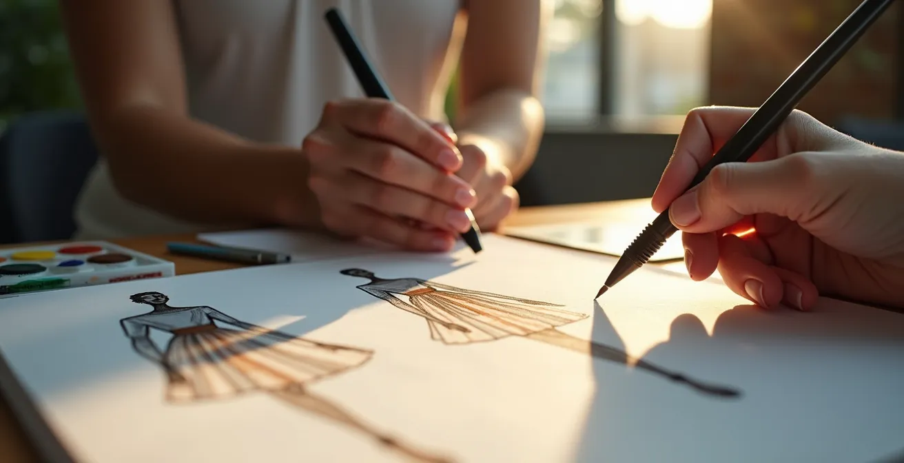
Markers vs Watercolors: Which Medium Suits Runway Sketching Best?
Your choice of medium is not merely a technical preference; it’s your first narrative decision. Markers and watercolors are not interchangeable tools; they are different languages for describing fashion. Markers, with their bold, consistent lines, speak of energy, structure, and immediacy. They are perfect for capturing the graphic power of a silhouette and the crisp details of a tailored garment. Watercolors, conversely, speak a language of mood, movement, and emotion. Their fluid, unpredictable nature is ideal for conveying the drape of soft fabrics and the ethereal atmosphere of a collection.
The decision of which to use for runway sketching depends entirely on the story you want to tell. Are you capturing the front-row energy and architectural lines, or the backstage mood and the poetic flow of the garments? The most advanced illustrators don’t just choose one; they create a stylistic tension by combining them. A marker outline can provide the structural skeleton, while a selective watercolor wash can breathe life and emotion into the sketch. This hybrid approach allows you to communicate both form and feeling, creating a much richer and more distinctive illustration.
This comparative table highlights how each medium serves a different narrative purpose, a key concept for developing a versatile style.
| Aspect | Markers | Watercolors |
|---|---|---|
| Speed | Instant application, 30-60 seconds per sketch | Requires drying time, 2-5 minutes per sketch |
| Portability | Highly portable, no water needed | Requires water containers and mixing palette |
| Line Quality | Bold, graphic, consistent | Fluid, organic, unpredictable |
| Color Blending | Limited blending, layer-based | Infinite blending possibilities |
| Best For | Front-row energy, structural details | Backstage mood, movement capture |
Mastering this choice is the first step toward a style that is both personal and professionally adaptable. It is about making an intentional selection to best serve the garment and the moment.
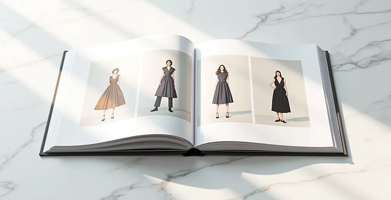
How to Build a Portfolio That Gets You Hired by Magazines?
Your portfolio is not a scrapbook of your greatest hits; it is a curated, persuasive argument for your unique artistic vision. In a market where authenticity is increasingly valued, art directors are looking for a distinct point of view, not just technical proficiency. In fact, the demand for human artistry is surging, with data showing that live fashion illustration bookings increased by 40% in the past year alone. This signals a clear desire for the unique energy that only a human hand can provide. Your portfolio must prove you possess that energy.
To achieve this, every piece must contribute to a cohesive narrative. Instead of showing a bit of everything, focus on 10-15 of your absolute best works that collectively define your « portfolio as thesis. » This thesis should be immediately apparent, whether your style is minimalist and graphic, or lush and painterly. Arrange your work into project-based series or mock editorial spreads. This shows an art director not just that you can draw, but that you can think like a collaborator and understand the context of their publication. A portfolio that presents a clear, confident, and consistent style is infinitely more powerful than one that is technically perfect but stylistically scattered.
This curated approach demonstrates a mature artistic identity. It shows you’ve moved past the student phase of experimentation and have arrived at a professional, marketable style that is ready to be commissioned.
Case Study: The Power of a Diverse, Signature Portfolio
Jenn Woodall, an award-winning illustrator from Toronto, demonstrates how a diverse portfolio showcasing both technical skill and narrative ability can open doors beyond traditional magazine work. Her distinct style, honed through a Bachelor of Design in both Illustration and Fashion Design, led to a publishing deal with Oni Press for her graphic novel series ‘Space Trash’ in September 2022. This proves that developing a strong, unique voice can attract opportunities across different industries, from editorial to publishing.
Action Plan: Auditing Your Portfolio’s Signature
- Contact Points: Lay out all your potential portfolio pieces. Does a consistent artistic signature—your unique way of handling line, color, and form—run through at least 80% of them?
- Collect Data: Inventory your specific stylistic elements. List your go-to color palettes, your typical line weight, and any recurring proportional exaggerations (e.g., long necks, large eyes). This is your artistic DNA.
- Check for Cohesion: Does this collection tell a single, coherent story about you as an artist, or does it look like the work of several different people? The goal is a unified authorial voice.
- Measure Memorability: Place three of your pieces next to work from an illustrator you admire. In a blind test, what specific, unique qualities would make your work instantly recognizable?
- Create an Integration Plan: Identify the one or two weakest pieces that dilute your signature. Create a concrete plan to either rework them to align with your core style or replace them with new work that strengthens your overall thesis.
The Anatomy Mistake That Makes Your Croquis Look Unprofessional
Many aspiring illustrators believe that achieving a professional look means mastering perfect, realistic human anatomy. This is a fundamental misunderstanding. The most common mistake isn’t poor anatomy, but rather inconsistent or unintentional stylization. Fashion illustration operates on a foundation of exaggeration. The standard fashion croquis is not anatomically correct; it is an idealized form. As explained by experts, the classic figure is 9 heads tall from the top of the head to the ankles, a deliberate elongation designed to make clothing appear more dramatic and elegant.
The problem arises when an illustrator’s proportions are accidentally wrong, not intentionally stylized. For example, drawing arms that hang down to the knees doesn’t look like a stylistic choice; it looks like a mistake because it breaks the internal logic of the established fashion figure. True professionalism comes from developing your own « anatomical signature. » This means making conscious, consistent decisions about how you will deviate from the 9-head standard. Will you draw figures that are 10 heads tall for an even more elongated look? Will your signature be defined by oversized hands, sharp angular shoulders, or a particularly fluid posture? The key is consistency.
Your unique proportional system, once established, becomes a recognizable part of your brand. It’s the difference between a drawing that looks « off » and a drawing that looks like *your* work. Don’t aim for realism; aim for a consistent and intentional stylization that serves the clothing and solidifies your artistic identity.
Why Hand-Drawn Illustration Is Making a Comeback in Digital Campaigns?
In an increasingly digital and automated world, there is a powerful and growing desire for the human touch. The rise of AI-generated imagery has created an unexpected consequence: a heightened appreciation for the authenticity, texture, and « perfect imperfections » of hand-drawn art. This is not just a nostalgic trend; it’s a strategic move by brands and publications seeking to connect with their audience on an emotional level. The data is clear: a recent report found that 87% of art directors actively avoid AI-generated imagery because it lacks the creative credibility and emotional resonance that defines their brands.
Hand-drawn illustration offers a tactile quality that digital tools often struggle to replicate. The subtle bleed of ink on paper, the visible grain of a watercolor wash, the confident wobble of a pencil line—these are not flaws. They are testaments to the artist’s hand and mind at work. This authenticity cuts through the digital noise and creates a memorable, human connection. As one agency director noted, this movement is a direct response to the machine-made aesthetic.
Perhaps a conscious backlash to the onslaught of AI, we’re expecting to see a resurgence of the human touch in artwork for 2024. In particular hand-rendered illustration, be it pencil, ink or paint, or digitally produced facsimiles of these techniques.
– Sam Walker, Brilliant Artists Agency
For you as an illustrator, this is a massive opportunity. It means your ability to create work with palpable texture and personality is more valuable than ever. Leaning into the unique qualities of your chosen medium isn’t just an artistic choice; it’s a powerful commercial advantage in a market saturated with sterile, algorithm-driven visuals.
How to Digitize Watercolors Without Losing Texture?
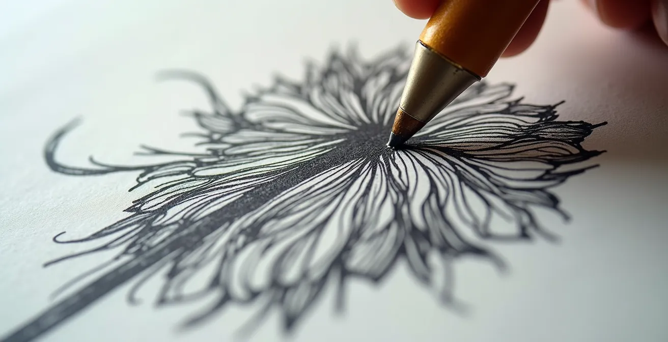
The comeback of hand-drawn aesthetics in digital campaigns presents a practical challenge: how do you translate the rich, tactile quality of a physical watercolor painting into a digital file without it looking flat and lifeless? Losing the subtle blooms, the paper grain, and the watery edges is a common frustration that can rob your work of its soul. The secret lies in a meticulous digitization process that treats lines, color, and texture as separate, valuable assets. A simple, low-resolution scan will not suffice.
A professional workflow involves scanning your artwork at a very high resolution (at least 600 DPI) to capture every nuance of the paper and paint. Many top illustrators go a step further, creating multiple scans of the same piece: one optimized for the crispness of the linework, and another balanced to capture the full range of color and transparency. In a program like Photoshop, these layers can be composited, often using a « Multiply » blending mode to allow the texture to show through the color. This process is about digital preservation, not just conversion.
This is where your « medium as narrative » becomes a digital asset. The most forward-thinking illustrators build extensive texture libraries from their own work, scanning not just finished pieces but also interesting watercolor washes, ink splatters, and different paper grains. These elements can then be used to add authentic, hand-made texture to digitally created illustrations, bridging the gap between the traditional and digital worlds. Mastering this technical process ensures that the human touch, so valued by art directors, is not lost in translation.
- Scan at 600 DPI minimum to capture all texture details.
- Create two separate scans: one for lines (high contrast) and one for color (balanced).
- Layer the scans in Photoshop and use the Multiply blending mode to combine them.
- Use a « Levels » or « Curves » adjustment layer to enhance the visibility of watercolor blooms and bleeds without blowing out the highlights.
- Save interesting texture elements, like paper grain or paint splatters, as separate files to build a digital asset library for future use.
- Export the final work in multiple formats, such as a layered PSD and a PNG with a transparent background, for maximum versatility.
Why Your Sketches Fail When Translated to Fabric?
One of the most disheartening moments for a fashion designer or illustrator is seeing a beautiful, dynamic sketch turn into a lifeless, ill-fitting garment. This failure rarely stems from the sketch’s artistic quality, but from a critical gap in communication between the creative vision and the technical execution. An artistic sketch is designed to sell a mood and a concept; a technical flat or pattern is designed to be built. Your job is to bridge that gap. The flowing lines that suggest drape in your drawing mean nothing to a pattern maker who needs to know exactly where a seam goes.
This is the crucial step of « structural translation. » An illustration that exists only as a piece of art is not a functional fashion design. To ensure your vision survives the transition to fabric, you must augment your artistic sketches with clear, technical information. This doesn’t mean sacrificing the beauty of your original drawing. It means supplementing it. Alongside your dramatic, stylized illustration, include simple, clear « flat » sketches showing the garment from the front, back, and sometimes the side. Use callouts and annotations directly on your artwork to specify details that the drawing only implies.
The table below illustrates the disconnect between a purely artistic sketch and the information a production team requires. Your goal is to provide the « Bridge Solution » for every element.
| Stylized Sketch | Technical Requirements | Bridge Solution |
|---|---|---|
| Artistic angle view | Front/back/side views needed | Add simple flat sketches alongside |
| Flowing lines suggest drape | Exact seam placement required | Include technical callouts on illustration |
| Beautiful rendering | Construction details missing | Create exploded view diagrams |
| Single dramatic pose | Full design unclear | Show multiple angles or turn views |
| Fabric texture implied | Material specs needed | Add fabric type annotations |
By thinking like both an artist and an engineer, you preemptively solve production problems and ensure that the final garment retains the integrity and spirit of your initial creative spark.
What Should Be in a Digital Fashion Portfolio to Get Hired?
When curating your digital portfolio, it’s easy to fall into the trap of thinking that « high fashion » means « hyper-realistic. » Many students focus exclusively on elegant, understated renderings, fearing that a more stylized or graphic approach won’t be taken seriously. This is a limiting belief that can stifle your unique voice. The reality is that the market for illustration is diverse, and a strong, signature style—even a non-traditional one—is a powerful commercial asset. In fact, some of the most successful artists are those with the most distinctive, stylized work.
Recent industry data reveals a surprising trend: according to IllustrationX’s quarterly data, comic art received the most enquiries in both November and December of last year, and two of the ten highest-earning illustrators work in these stylized genres. This data should be liberating. It proves that there is a significant commercial appetite for illustration that is bold, graphic, and full of personality. An art director looking for a comic-style illustrator for a campaign won’t be swayed by a portfolio full of delicate watercolor renderings, no matter how skillful they are.
Therefore, your digital portfolio must be an honest and confident reflection of your true artistic signature. If your passion lies in creating bold, graphic characters, lean into it. Build a portfolio that showcases this skill with unwavering focus. Include projects that demonstrate how your unique style can be applied commercially—mock ad campaigns, animated lookbooks, or character designs for brands. A portfolio that makes a strong, clear statement about your unique style is far more effective than one that tries to be a jack-of-all-trades and ends up a master of none.
Key takeaways
- A signature style is not found; it is consciously built through strategic decisions about medium, anatomy, and narrative.
- Your portfolio should function as a cohesive thesis, proving your unique artistic voice, rather than a random collection of your best work.
- The market increasingly values the authenticity and « human touch » of hand-drawn art as a response to sterile, AI-generated visuals.
How to Transition from Sketch to Structure Without Losing Design Integrity?
The journey from a fluid, energetic sketch to a structured, buildable design is where many brilliant ideas lose their soul. The croquis is the essential starting point; as design teams note, it helps designers quickly translate ideas onto paper and visualize fit and proportion. However, the initial sketch captures an essence, a feeling. The final pattern requires precision, a set of cold, hard instructions. Preserving the integrity of your design through this transition is the ultimate test of an illustrator and designer.
The key is to treat your initial sketch not as a blueprint, but as a « mission statement. » Before you even think about technical flats, you must identify the core elements that define the design’s spirit. Is it the dramatic volume in the sleeve? The specific, delicate way the fabric drapes across the collarbone? The aggressive sharpness of the shoulder line? Identify these 1-3 « unmissable » features. These are the non-negotiable elements that must be protected at all costs throughout the technical development process.
This requires a proactive and communicative workflow. Create a simple muslin toile to test the proportions of these key features in 3D. Accompany your technical flats with mood boards and notes that explain the *artistic intent* behind the design for the pattern maker. By establishing this clear hierarchy of importance, you provide guidance to your technical team, ensuring they understand what to prioritize. This process transforms you from a mere renderer into a true design guardian, shepherding your vision from a whisper of an idea into a tangible, structured reality without sacrificing its original magic.
Now, armed with this strategic framework, the next step is to pick up your pencil or brush not just to practice, but to make a deliberate choice. Start your next illustration by consciously defining the story you want to tell and select the tools and techniques that will best bring that specific narrative to life.
Frequently Asked Questions about How to Find Your Unique Style as a Fashion Illustrator?
Why do fashion figures look so tall and thin?
Fashion croquis are intentionally drawn with exaggerated proportions, often 9 to 10 heads tall instead of the realistic 7.5 or 8. This is a long-standing convention in the industry to give garments an elegant, elongated, and more dramatic appearance on the page, showcasing the flow and design of the clothing more effectively.
What’s the biggest hand and foot mistake beginners make?
The most common mistake is creating unintentionally disproportionate limbs, such as arms that are so long the hands hang down to just above the knees. While stylization is key, proportions must follow a consistent internal logic. Such an error breaks that logic and reads as a mistake rather than an artistic choice, undermining the professionalism of the sketch.
Should I always follow the 9-head rule?
Absolutely not. The 9-head rule is a traditional starting point, not a creative straitjacket. Developing your unique style often involves intentionally breaking or modifying this rule to create a signature look. You can and should adjust proportions to better reflect your personal aesthetic or to design for more diverse and realistic body types that align with a specific brand’s target demographic.